MOTION DS

Circa 2022
Exceptional motion has been a lifelong passion of mine, whether in films or digital products. While the Waze DNA was initially crafted with a focus on delightful motion, I noticed inconsistency in its application to new features. Determined to address this, I took action.
While it's now widely recognized that companies investing in a design system is a crucial step for engineers, designers, and stakeholders, the importance of investing in a motion design system may not be as apparent.
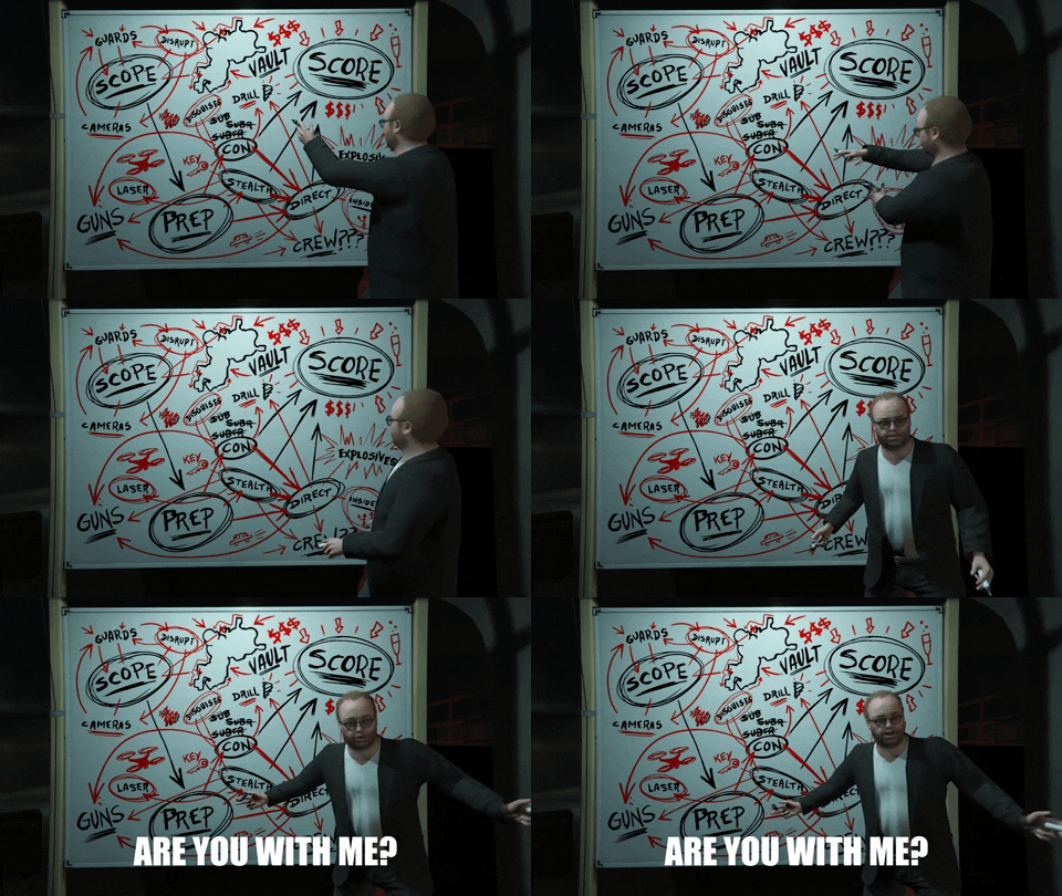
Until 2022, discussions about motion between designers and engineers at Waze felt somewhat like this

Some designers cared, some didn't, some engineers cared, some didn't. It was apparent that navigating in the app felt inconsistent in terms of excellence and overall polish. So in order to cut down those awkward conversations, I created our very own motion design system.

First, I defined our 'Motion tokens', here are a few examples:

Definition:


These tokens have a built in motion curve + duration. Later on we moved to fully support spring animation across iOS, Android and the Web (the spring's duration is dictated by it's physics). I wanted the UI components to move like real world components + restore the 'Wazyness' feel the app had in it's early days.


For example, ‘Heavy’ components like sheets and menus upon entry will take more friction and will land slowly. On the other end, it's exit animation will start slow and end fast due to it's weight.

Definition:

These tokens have built in motion curve + duration. Later on we moved to fully support spring animation across iOS, Android and the Web (the spring's duration is dictated by it's physics). I wanted the UI components to move like real world components + restore the 'Wazyness' feel the app had in it's early days.


For example, ‘Heavy’ components like sheets and menus upon entry will take more friction and will land slowly. On the other end, it's exit animation will start slow and end fast due to it's weight.

From Motion tokens to full design system components

We made a big impact in the daily life of engineers and designers, with no need to define transitions in their various projects.

The next step was to bake Motion tokens into every design system component, so each one will have it's own entry and exit animation. After this work, there was almost no need to define transitions as the component already knows how to enter and exit the canvas.

But not all animations are the same

For complexed animations, that involves an orchestra of multiple objects entering and existing, we built movement tokens to help the designers describe in a timeline what they expect to happen.

Summary:

The new design motion system had a tremendous impact on our product velocity. Designers rarely need to define motion. Engineers have baked in components with no need to invest time in coding those 'annoying design requests', and the product feels more polished then ever.